Understanding the Basics of Email Campaigns
Why Email Campaigns Are Your Secret Weapon
Picture this: your email lands in someone’s inbox, cozy among birthday reminders and online shopping receipts. It’s personal, it’s direct, and when done right, it doesn’t just sit there—it demands attention! An effective email campaign is not a random shot in the dark; it’s a carefully aimed arrow that hits your audience right where it matters.
The magic begins with understanding the foundation of your campaign. Who are you talking to? What do they care about? Forget the idea of a “one-size-fits-all” approach. People crave connection. Segment your audience—are they avid shoppers? Knowledge-hungry readers? Jet-setters always looking for a deal?
- Define your audience personas—and name them if it helps (Hi, Savvy Sarah!).
- Map out their journey, from “Who is this?” to “Yes, sign me up!”
- Choose a clear goal: Do you want clicks, sales, or perhaps just to build trust?
Your content should feel less like a billboard by the highway and more like a handwritten note slipped into their mailbox. The basics may seem simple, but they’re where every great campaign takes root.
Crafting Compelling Email Content

How to Spark Curiosity and Connection
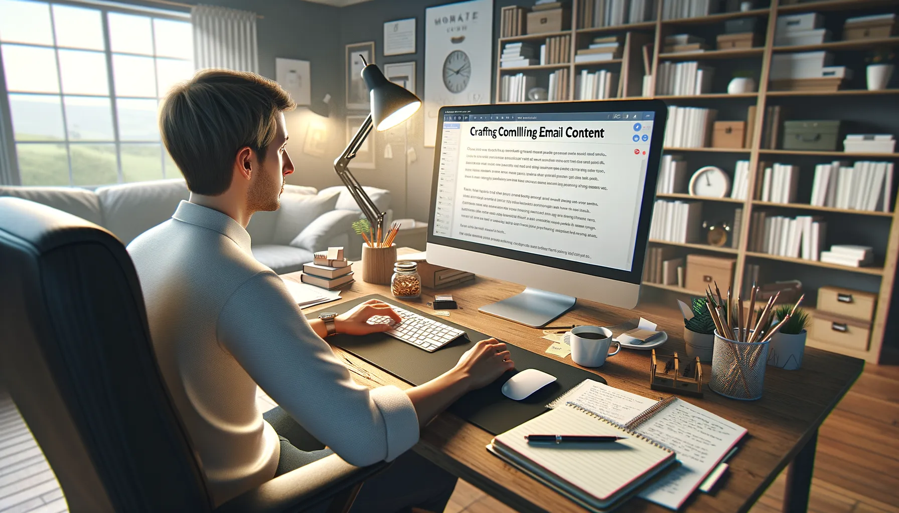
Ever read an email that felt like it was speaking *just* to you? That’s the magic of compelling email content. At its core, it’s about understanding your audience deeply—what they dream about, worry over, or can’t stop Googling at 2 a.m. Every word needs to earn its place.
Start with a subject line that stops the scroll. Think of it as the flashy bait on a fishing line. For example, instead of “Our New Product Line,” try “Finally—A Solution You’ll Love.” The goal? Make them pause, raise an eyebrow, and open it.
Once they’re in, your email should feel like a cozy conversation over coffee. Skip the corporate jargon and get real. Use stories, questions, or surprising facts that resonate emotionally. Picture this: Instead of talking about how your app is fast, share a quick story about how it saved someone’s day in 10 minutes flat.
- Write shorter sentences—they hit harder.
- Add a sprinkle of humor or sass (where appropriate).
- Call out their pain points, then show how you solve them.
Emails aren’t essays. They’re bite-sized moments of connection. Readers should nod along, laugh, or think, “Wow, this is *exactly* what I needed!”
Designing for Engagement and Readability

Visual Elements That Spark Joy
Picture this: your email lands in someone’s inbox, and it’s love at first sight. How? By designing visually stunning, easy-to-navigate emails. Think of email design as setting the stage—the spotlight falls on your content, but the surroundings have to shine too. Use a clean, uncluttered layout. White space isn’t wasted real estate; it’s breathing room for your reader’s eyes.
Colors? Oh, they’re your secret weapon. Stick to your brand palette, but don’t shy away from contrasts that make buttons pop. A muted background paired with a juicy, bold CTA button? Chef’s kiss. Don’t forget your font choices—they should be legible across screen sizes. (Say no to tiny text or overly playful fonts that scream 1999.)
- Keep readability in mind: larger font sizes for headers and body text around 14-16px work wonders.
- Include enough spacing between sections—it’s like giving your words a comfortable chair to sit on.
Mood Matters: Emotional Design Cues
Design isn’t just about visuals—it’s an emotional experience. Pull your readers in with imagery that resonates. For example, a travel company might use sweeping beach photos, while a tech brand could lean on sleek, futuristic designs. Visuals should whisper promises of possibilities, not yell chaos.
Icons can also work magic. A simple envelope icon next to your “Reply Here” link feels welcoming, doesn’t it? Meanwhile, your CTAs need to stand out like a friendly hand inviting readers to click. A CTA that reads “Tell Me More” or “I’m In!” adds personality—and that spark of connection.
Strategies to Improve Open and Click Rates

Why First Impressions Start in the Inbox
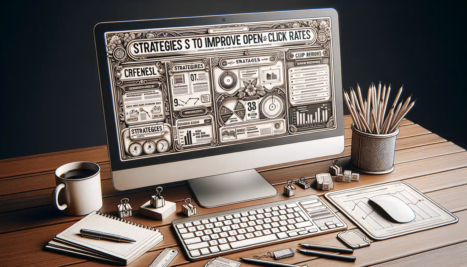
Your email subject line is like the cover of a bestselling book—it has to *wow* readers on sight. To improve open rates, make subject lines irresistible. Maybe it’s a question that sparks curiosity, like: “Are You Missing Out on These 3 Insider Secrets?”, or a playful teaser such as “Guess What Just Landed in Your Inbox…”. Personalization is key here. Use the recipient’s name or reference something specific to them—seeing their name in lights (or at least in the subject line) can boost opens by leaps and bounds.
And don’t let your sender name feel cold or robotic. People connect with people. Instead of “[email protected],” opt for something warmer, like “Sarah from Brilliant Co.”. Trust me, inboxes are ruthless battlegrounds. Stand out or be forgotten.
The Secret Sauce for Click-Worthy Emails
Got them to open? Great. Now, let’s talk about how to get those fingers clicking. Hook them with a strong call-to-action (CTA). Keep these quick, clear, and action-oriented:
- “Snag Your Free Guide Today!”
- “Shop the Exclusive Sale Before Midnight”
And don’t just bury those CTAs at the bottom—drop them in more than once!
Visuals matter, too. A bold button in eye-catching colors works far better than a plain-text link. Pair it with white space to let your message breathe. After all, nobody loves clutter—neither do your readers’ eyes!
Measuring Success and Optimizing Campaigns

Tracking the Pulse of Your Campaign
Let’s be honest—sending out an email campaign without measuring its success is like cooking a feast blindfolded. You might get something great, or you might serve burnt toast. Tracking the right metrics turns on the lights and helps you see where you’re winning your audience’s hearts and where you’re falling flat.
Some of the key players in your data:
- Open Rates: Are your subject lines tempting enough to tap?
- Click-Through Rates (CTR): Are those links irresistible?
- Conversion Rates: The ultimate prize—did they take action?
Each number tells a story. A high open rate but dismal clicks? That could mean your email sparkled at first glance but fizzled in the details. What’s your gut telling you—did the design fall short? Or maybe the CTA needs more “oomph”?
Fine-Tuning for Perfection
Think of this step as sharpening your favorite tool. Dive into A/B testing to see what makes your audience tick. Try swapping that formal “Learn More” button for a cheeky “Show Me!” or send your emails at different times. Even small tweaks can reveal golden insights.
It’s all about inching closer to what your audience *loves*.


